


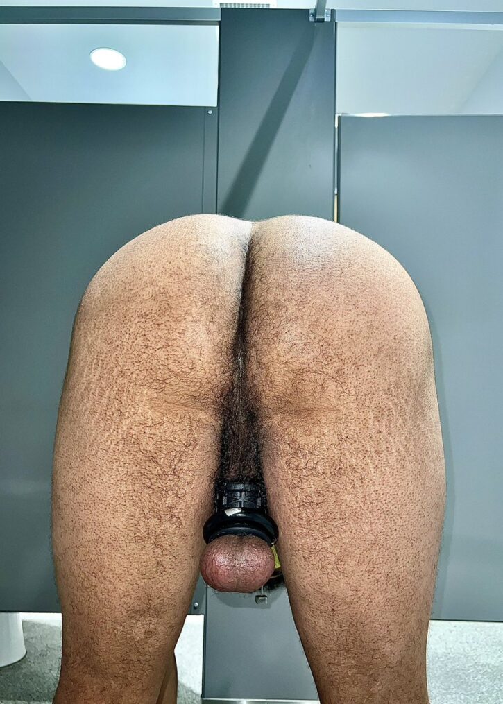
1
- Advertisement -
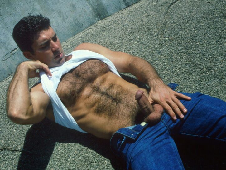
2
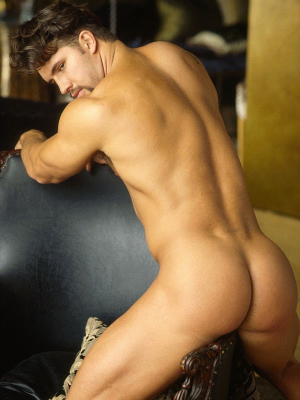
3


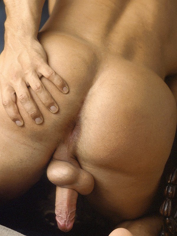
4
- Advertisement -
5

6
7
- Advertisement -
8
9

10


11
12
13
14
15
16
17
18
19
20

All material on Squirt.org is uploaded by members for the purpose of meeting other men for online connections and/or sex. By entering this site, all members agree to Squirt’s terms of service and guidelines.
Disclaimer: this website contains adult material. All members and persons appearing on this site have contractually represented to us that they are 18 years of age or older. 18 U.S.C. 2257 record keeping requirements compliance statement.
©2022 Pink Triangle Press, all rights reserved. SQUIRT® and SQUIRT.ORG® are trademarks of Pink Triangle Press.
1, 3, 4, 11, 13, 17 and 19.
Okay. Not sure if it’s just showing on my screen or if this is something new but I’m not entirely thrilled with the white background I’m seeing here (it’s REALLY intense). I *do* like, however, the fact that the “previous article” and “next article” tabs/buttons seem to have returned.
And, on to the pics themselves:
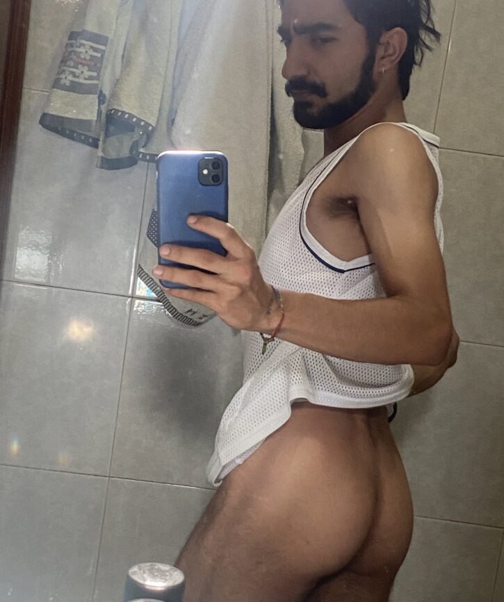
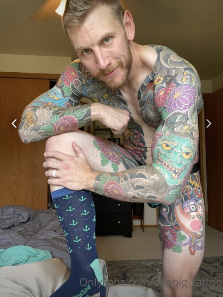
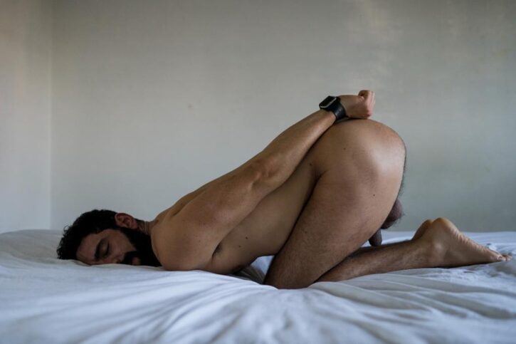
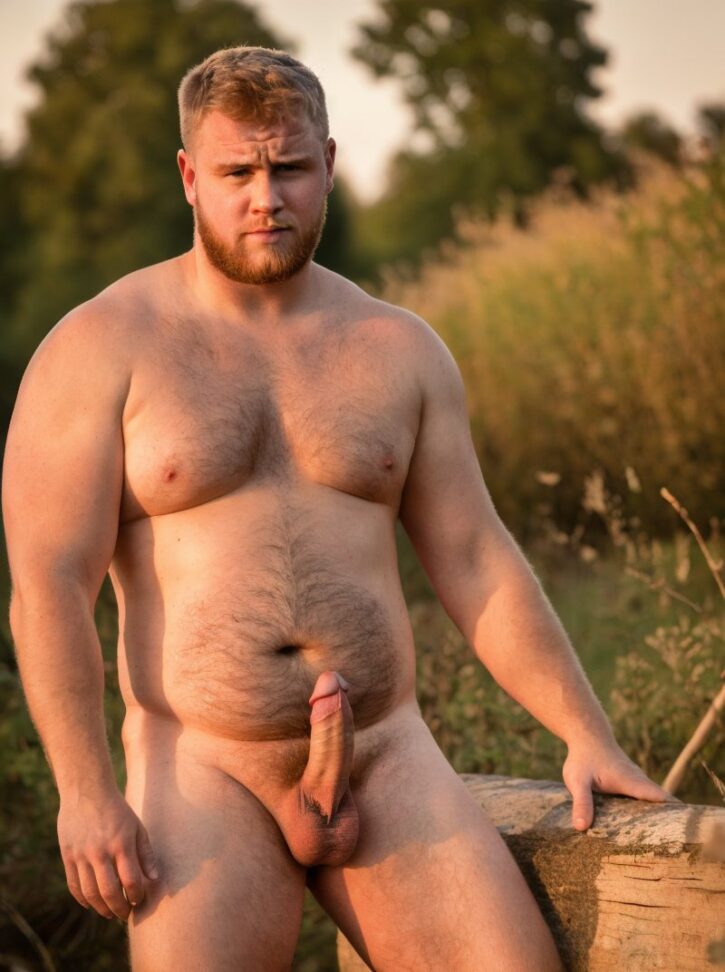
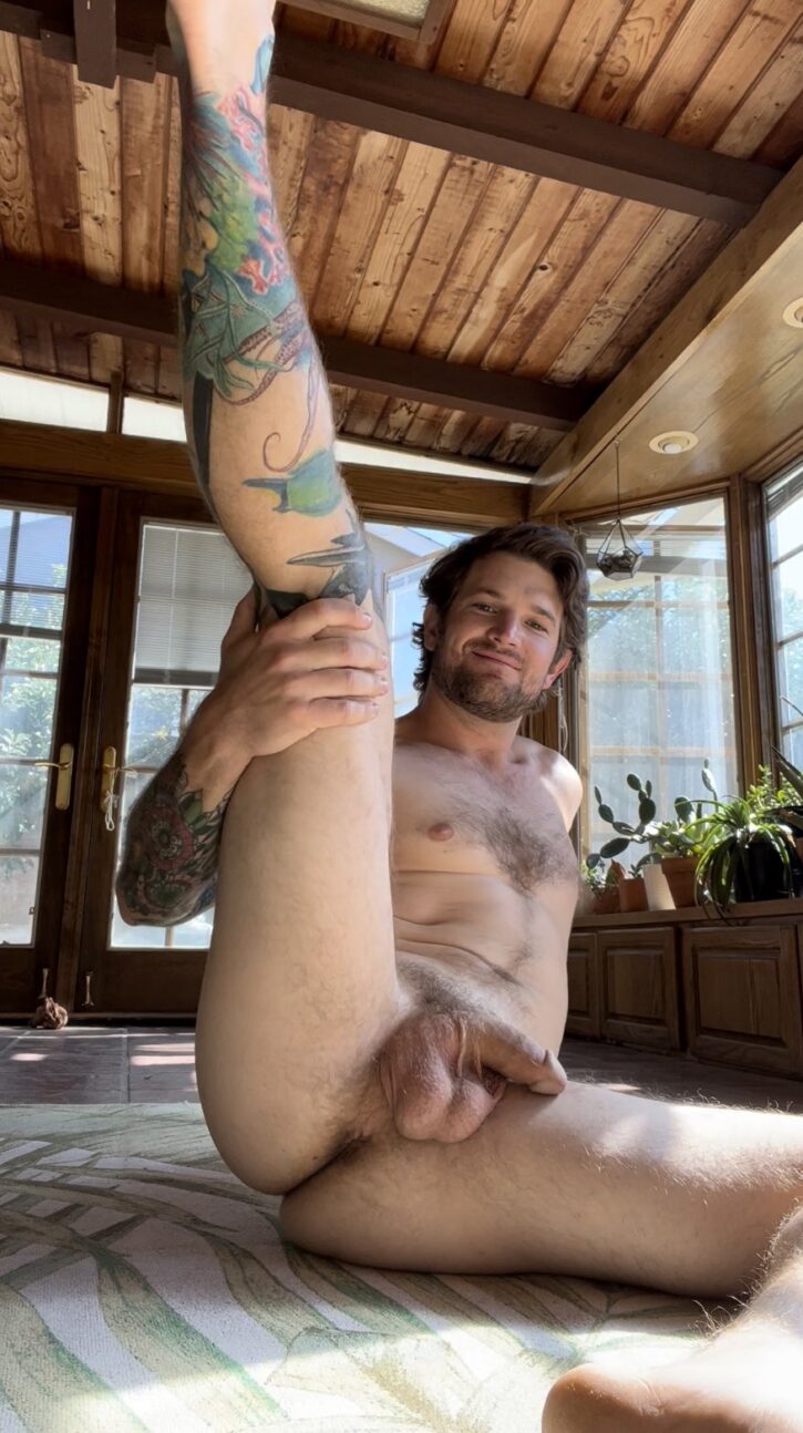
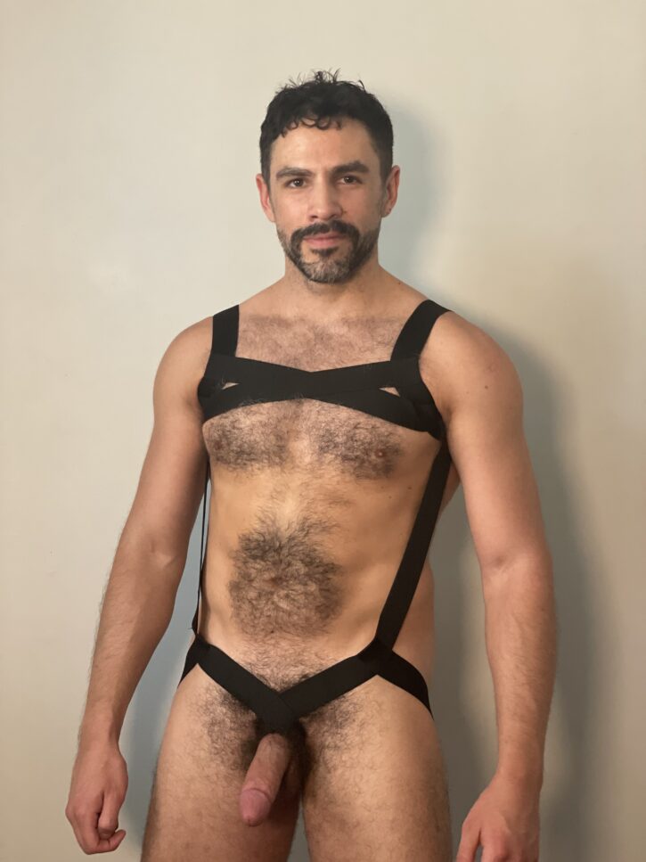
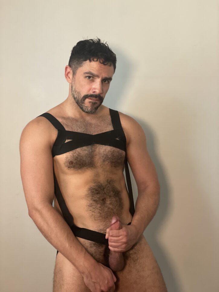
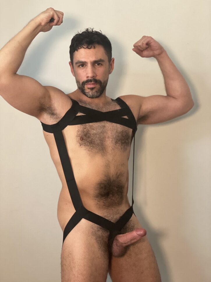
Definitely #3 and #4. #7 and #12 are strong maybes. #15 is a definite if we get rid of that silly outfit thing he’s wearing. #11 was fine till the clothes came off and #13 was nice except for the “artwork.”
I’m not a fan of the white background either. Hurts my eyes at night when I’m generally online.
Can’t say I’m too thrilled about the white background either
I don’t always agree much with many here but, I have fully agree! The black is easier on the eyes, especially later in the evenings or when you’re not feeling well. The white can go!
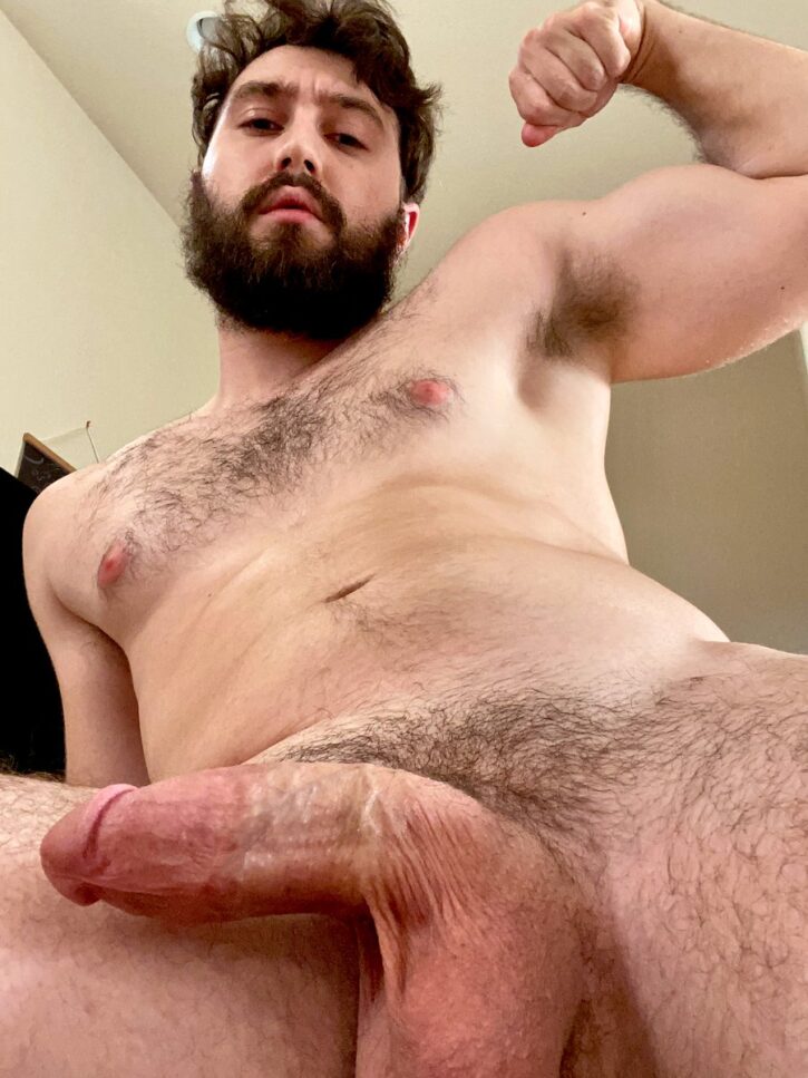
3, 4, & 17. I know #4 is a pornstar from the past, but does anyone know his name?
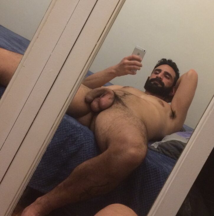
1, 3, and 15
3, 4, 11, 13.
1, 12, 14 please….especially 12
3 – gorgeous hunk of man, great abs, luv the hairy chest, 14 – 2 big, thick cocks to suck, YUM!!!! & 17 – gorgeous guy, great body and a BIG cock. Don’t like the new white background, very bright early in the morning.
4, 7, 11, and 12
WHITE BACKGROUND has to go ASAP …… fire the IDEA GUY from MARKETING !!!!! Then this whole set is TERRIBLE. NUMBER 14 might be a threesome for UNCUTOAK ,but I would recommend they brace themselves.
1,4,11,12,14,18
Creepy is creeping yet again and never learns from past mistakes
I agree with all other guys–get rid of the white background. very irritating. Number one favorite is #15, especially the first picture—on my knees in a second. yummy . Second choice $14- brings back high school football memories. plow a new row farmer guy.
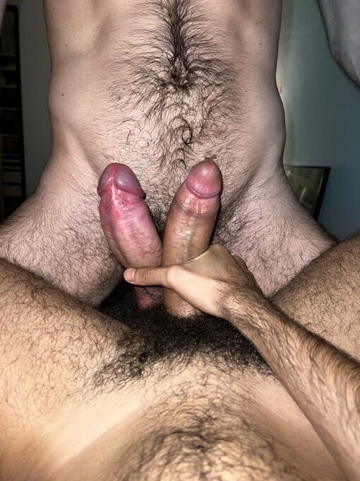
OOPS, correction, farmer guy is #12 not 14. #14 just reminds me of other good times.
4,17,and 18.
Not a great set! Too many hairy guys or excessive ink!
Not crazy about the white background neither!
You had me at 12, what a hunky husky man. Yes please.
6, 10 and 12 – most def 12
10. 11. 13